
Sketch-ing Out my New Logo
Using Sketch, I was able to create a Big Sur-inspired refresh of my BasicAppleGuy logo.
When Apple announced macOS Big Sur at WWDC20 in June, I was struck by the splash of vibrancy it brought to the Mac. From the wallpapers, shading, icons, and use of transparency, every UI element had been redesigned in a way that breathed new life into the OS. Inspired by that refresh, I began to contemplate how the logo I’d created for the site would look like if it received the Big Sur makeover. Today I’m excited to unveil the finished project!
I’m incredibly proud of how this project turned out, given that I started from a place of having very little design knowledge of how to use a vector graphics editor. I’d bought Sketch on a whim several years ago, hoping that somehow simply owning the app would naturally imbue me with design talent (don’t ever think this way… this is stupid, stupid thinking). That mentality didn’t get me very far, and beyond tinkering with a few small projects here and there, Sketch remained relatively unused for many, many months.
The truth is (go figure!) that learning how to use this software requires a combination of curiosity, experimentation, inquisitiveness, luck, and on occasion, the frustration tolerance of a monk.
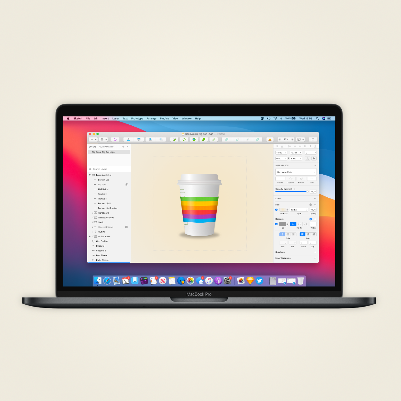
The ”Process”
I started the design by going online and studying images of coffee cups to learn the proportions, shading, and dimensions. It was easy enough to drag an image into Sketch and begin outlining and the various components of the logo; from how tall the cup should be relative to the lid or where the sleeve should rest on the cup.
With the cup outlined, next came the inquisitive/experimentation phase. I need to remind you that I have next to no experience with Sketch, so when I needed to figure something out, say, how to add shading to a rounded object, I would start to turn to Google and YouTube with searches like: “how to do shading in Sketch for Mac?”, ”Adding shadows in Sketch,” and “How do I quickly become an amazing designed with little effort, skill, or know how?” Generally, within 4-5 results, I had enough knowledge to begin experimenting inside the app.
I tried to break down the logo into several discrete elements (e.g., Top lid, middle Lid I, Middle Lid II, Bottom Lip, etc.). This partitioning may have been a bit of a Frankenstein’s monster approach, but it helped simplify what I wanted to do with each specific element. First, I would conceptualize the task: the shading on this shape starts as darker to the left, becomes light near the middle, & then darkens again as you move further to the right, and then look at the tools within Sketch to see which tool (e.g., gradient) could help me achieve this effect.
This experimentation began a phase in my design of consistently pressing ⌘Z as I made a change, undid it, made a few more adjustments, undid those, sighed heavily, continued onward etc. Sketch (thankfully!) is very forgiving, so as long as I kept track of the changes I was making, I could skip forwards or backwards and restore the setting I liked more. When in doubt, I would duplicate a layer so I could mess around with it before deciding if I wanted the changes.
As more and more of the elements came together, I continued to refine aspects of the design. One example was when I tried to find a way to add texture to the sleeve. Again, I went to Google and typed out: “how do you add texture to shapes in Sketch?” which gave me a masking tutorial. I went to a FreePik, a site that hosts thousands of royalty-free images, and located a couple of candidate images that I thought might fit the bill. Trial and error ensued as I tried to figure out the desired opacity and which effect: screen, overlay, darken, or exclusion (not exclusion, never exclusion!), gave the sleeve the texture effect I desired.
Last came rounds of inconsequently minor tweets as I adjusted a pixel here, a gradient there, and changed the shadow blur from 13 to 14 (then back to 13, then to 40 just to see what would happen, and then down to 14 again). As Leonard da Vinci wrote, “Art is never finished, only abandoned." After hours of tweaking, I finally stopped the madness, threw up this post, and put the project to rest.

The new, Big-Surified, BasicApple logo.
Conclusion
At the start of this project, I felt that there was "no f'ing way!" I would be able to create what ultimately became this finished graphic. I've looked on with envy at graphic designers whose every stroke seemed to produce a fine work of art, and I think I took for overlooked the tremendous effort & practice that are inherit in their work.
And by no means is this meant to be an "if I can do it, anyone can" piece, but rather a post to express the hard work, frustration, persistence, and luck it takes to learn a new skill. This wasn't easy at all; it was frustrating, challenging, and time-consuming, but it was also engaging, highly fulfilling, and in the end produced something that I am very proud of having made.
Humble Origins

From Left to Right: Left: Hideous V. 1.0 logo I launched my twitter account with in February; Middle: Current logo, released in March; Right: My more realistic interpretation of the BasicAppleGuy logo inspired by the more dimensional icons introduced in macOS Big Sur.
External Links
Website: Sketch for macOS